20 ggplot2 통계 그래픽의 기초
ggplot2 패키지의 gg는 grammer of graphics의 약자로, 그래프의 문법을 말한다. 이 패키지는 통계학자 Leland Wilkinson가 “The Grammar of Graphics”라는 책으로 개념을 정리한 통계 그래픽의 문법에 바탕을 두고, 해들리 위캄(Hadley Wickham) 등이 R 언어로 구현한 것이다.
그래서 ggplot2 패키지를 사용하여 그래프를 만들기 위해서는 먼저 그 문법을 이해해야 한다.
20.1 Grammer of Graphics(그래프 문법)
ggplot2의 핵심 개념을 요약하면 다음과 같다.
-
매핑(mapping)
- 데이터셋의 변수를 그래프의 시각적 요소에 매핑한다.
- 예를 들어 막대 그래프는 (범주형) 데이터의 개수를 카운트하여 그 수를 막대의 높이로 표시한다.
-
ggplot2의 데이터셋은 tidy 데이터프레임을 사용한다.- 따라서 필요한 경우 데이터프레임으로 변환시킬 필요가 있다.
- Untidy 데이터프레임은 tidy 데이터프레임으로 만들고 시작한다.
- 시각적 요소를 aesthetics라고 한다.
- 예를 들어 다음과 같은 aesthetics가 있다.
- 위치(position)은
position aesthetics라고 하고, 실제로x,yaesthetics가 있다. 이것은 데이터를 위치라는 시각적 요소로 변환한다. - 색상(color)는
color aesthetics라고 한다. 이것은 데이터를 색상이라는 시각적 요소로 변환한다. - 형태(shape)는
shape aesthetics라고 한다. 이것은 데이터를 형태라는 시각적 요소로 변환한다. - 크기(size)는
size aesthetics라고 한다. 이것은 데이터를 크기라는 시각적 요소로 변환한다.
- 위치(position)은
- 예를 들어 다음과 같은 aesthetics가 있다.
- 매핑은
aes()함수 안에서 지정한다.aes(x = wt, y = mpg, color = factor(cyl))이라고 하면 이것은wt변수를x축에,mpg변수를y축에,cyl변수를coloraesthetics에 매핑한다는 뜻이다.
- 데이터셋의 변수를 그래프의 시각적 요소에 매핑한다.
-
셋팅(setting)
- 셋팅은 데이터에 따라 매핑하는 대신 사용자가 임의로 지정하는 것을 말한다.
- 예를 들어 막대 그래프의 색상은 데이터에 따라 결정되지 않고 사용자가 임의로 지정할 수 있다. 그래서
setting이라고 한다. - 셋팅은
aes()함수 밖에서 지정한다. - 예를 들어
geom_bar(color = "steelblue")는 막대의 색상을 파란색으로 지정한다.
- 예를 들어 막대 그래프의 색상은 데이터에 따라 결정되지 않고 사용자가 임의로 지정할 수 있다. 그래서
- 셋팅은 데이터에 따라 매핑하는 대신 사용자가 임의로 지정하는 것을 말한다.
-
지옴(geoms)과 통계 변환(stat, statistical transformation)
- 지옴(geoms)은 시각적 요소를 말하고, 통계 변환(statistic transformation)은 데이터를 통계적으로 변환하는 것을 말한다.
- 지옴은
geom_*()함수로 만들고, 통계 변환은stat_*()함수로 만든다. - 이 둘은 밀접하게 연결되어 있어서,
geom_*()함수 안에서stat이라는 인자에 통계 변환을 지정할 수 있고,stat_*()함수 안에서geom이라는 인자에 지옴을 지정할 수 있다.- 따라서, 유연하게 지옴을 정하고 나서 통계 변환 방법을 지정할 수 있고, 반대로 통계 변환 방법을 정하고 나서 지옴을 지정할 수 있다.
- 예를 들어
-
geom_bar()함수는 디폴트로 데이터를 카운트하여 막대의 높이를 결정한다.geom_bar(stat = "count")가 디폴트이다. -
stat_count()함수는 데이터를 카운트하여 막대의 높이를 결정한다.stat_count(geom = "bar")가 디폴트이다.
-
-
레이어를 쌓아서 그래프를 만든다(layer by layer).
-
ggplot2는 레이어를 쌓아서 만들고, 각 레이어는+연산자를 사용하여 추가한다. - 레이어를 명시적으로 정의하여 사용하는 대신,
geom_*()함수나stat_*()함수가 레이어를 생성시킨다(명시적으로 지정할 수도 있다). - 레이어는 독립적인
데이터,매핑,지옴,통계 변환을 가질 수 있다. - 예를 들어 다음과 같은 레이어를 쌓아서 그래프를 만들 수 있다.
ggplot(data = mpg) + geom_point(aes(x = cty, y = hwy)) + geom_smooth(aes(x = cty, y = hwy))- 이 코드는 점을 표시하는 레이어와 선을 표시하는 레이어를 쌓아서 그래프를 만든다.
-
-
스케일(sales)와 가이드(guide)
- 스케일(scale)은 데이터를 디자인 요소에 매핑할 때 사용되는 함수이다.
- 가이드(guide)는 레전드(legend)와 축(axis)을 말하고, 스케일 함수의 역함수(reverse function)이다.
-
좌표계(coordinate system)
- 좌표계는 그래프에서 사용할 좌표계를 결정한다.
-
패시팅(facet)
- “small multiple”이라고도 하는데, 데이터를 작은 데이터셋으로 나누어 각각의 데이터셋에 대해 그래프를 만들고, 이것들을 모아서 배치하는 것을 말한다. 그룹별 차이 등을 확인하는 데 유용한다.
-
테마(theme)
- 테마는 그래프의 디자인을 결정한다.
- 테마는
theme()함수로 제어한다. - 이 함수 안에서 그래프의 주요 요소들을 제어할 수 있다.
처음에는 이런 내용들이 다소 추상적이어서 이해하기 어려울 수 있지만, 실제로 그래프를 만들어 보면 이해가 쉬워진다. 이제 실제로 그래프를 만들어 보면서 이 내용을 이해해 보자.
ggplot2 패키지를 로딩한다.
20.2 ggplot2로 그래프 만들기
ggplot2 패키지로 그래프를 만들 때는 일반적으로 다음 문법을 따른다.
ggplot(data = <데이터>) +
    geom_<지옴타입>(aes(<매핑>)) +
    <다른 레이어>
먼저 그래프에 사용할 데이터프레임을 로딩한다. ggplot2는 tidy 데이터프레임을 사용한다. 따라서 필요한 경우 tidy 데이터프레임으로 변환시킬 필요가 생기기도 한다.
Rows: 5,110
Columns: 12
$ id                <chr> "9046", "51676", "31112", "60182", "1665", "56669", …
$ gender            <fct> Male, Female, Male, Female, Female, Male, Male, Fema…
$ age               <dbl> 67, 61, 80, 49, 79, 81, 74, 69, 59, 78, 81, 61, 54, …
$ hypertension      <fct> No, No, No, No, Yes, No, Yes, No, No, No, Yes, No, N…
$ heart_disease     <fct> Yes, No, Yes, No, No, No, Yes, No, No, No, No, Yes, …
$ ever_married      <fct> Yes, Yes, Yes, Yes, Yes, Yes, Yes, No, Yes, Yes, Yes…
$ work_type         <fct> Private, Self-employed, Private, Private, Self-emplo…
$ residence_type    <fct> Urban, Rural, Rural, Urban, Rural, Urban, Rural, Urb…
$ avg_glucose_level <dbl> 228.69, 202.21, 105.92, 171.23, 174.12, 186.21, 70.0…
$ bmi               <dbl> 36.6, NA, 32.5, 34.4, 24.0, 29.0, 27.4, 22.8, NA, 24…
$ smoking_status    <fct> formerly smoked, never smoked, never smoked, smokes,…
$ stroke            <fct> Yes, Yes, Yes, Yes, Yes, Yes, Yes, Yes, Yes, Yes, Ye…
이 데이터셋을 ggplot() 함수에 전달하여 그래프를 만든다.
ggplot(stroke_df)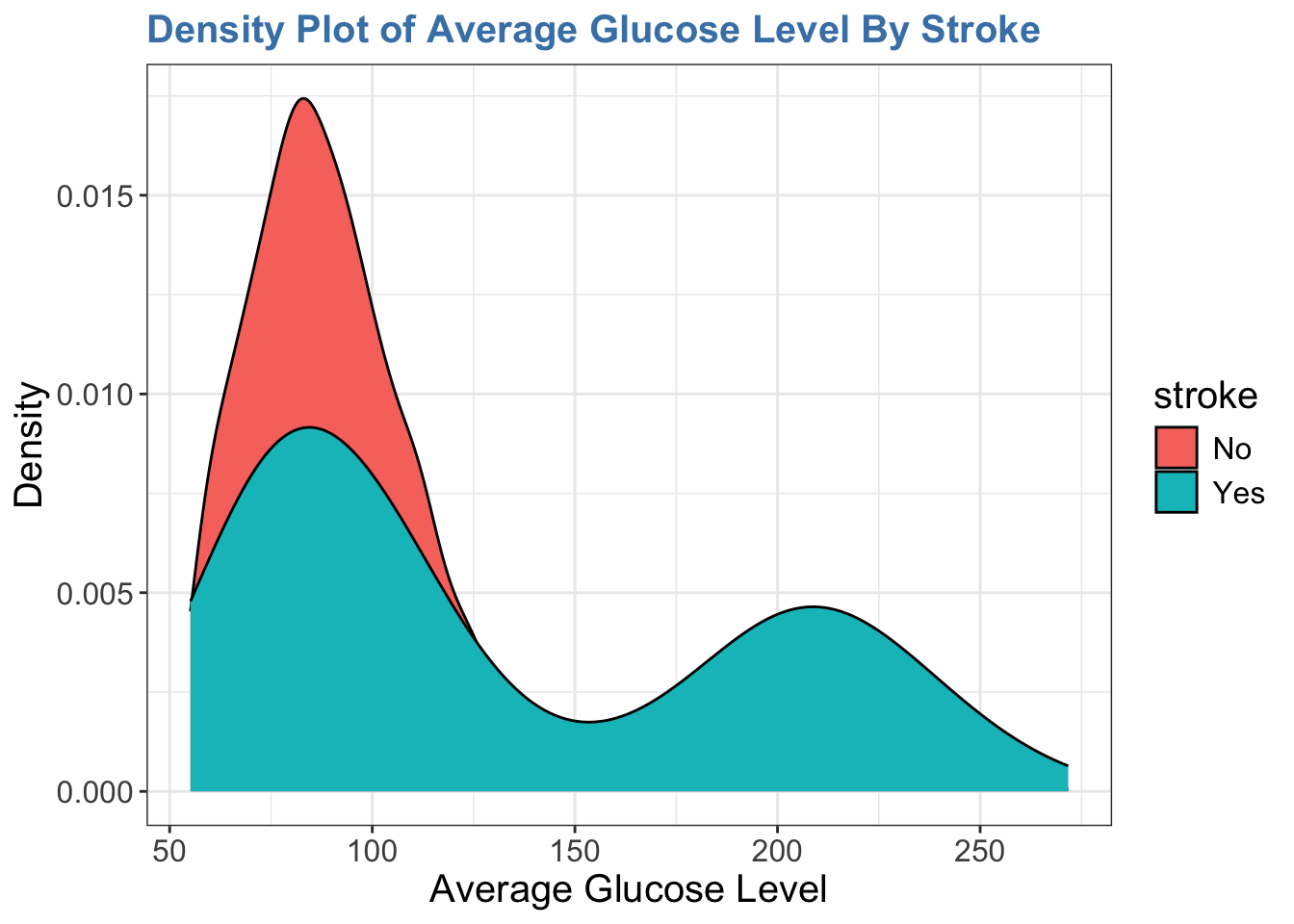
위에서 보는 것처럼 이 단계에는 빈 레이어 하나만 생성된다. 이렇게 그래프를 만들 데이터프레임이 준비되었다면, 그 다음 할 일은 매핑과 그런 매핑으로 어떤 시각적 요소를 만들지를 결정하는 것이다. 모든 통계 분석 과정에서 그러한 것처럼, 변수가 가지고 있는 값의 종류, 즉 데이터 타입에 따라 매핑을 결정되는 경우가 많다.
위 데이터프레임에서 범주형 변수인 stroke과 또 범주형 변수인 hypertension에 관한 그래프를 만들어 볼 계획이다. 이런 범주형 변수의 시각화는 기본적으로 카운트(count)에 기반하게 되고, 가장 흔히 사용되는 시각화 방법을 카운트된 값을 막대의 높이로 표시하는 막대 그래프(bar plot)이다. 이런 내용을 기반으로 마음 속에 또는 종이에 만들고자 하는 그래프를 먼저 그려보는 것이 좋다. 그 다음 코딩을 시작한다.
-
geom_bar()함수를 사용하고,aes()함수를 사용하여 데이터를 매핑한다.-
xaesthetic에hypertension변수를 매핑한다. -
fillaesthetic에stroke변수를 매핑한다. - 이런 레이어를 정의하면서
+연산자를 사용하여 기존 레이어에 추가한다.
-
아래 코드에서 보듯이 ggplot2에서 데이터프레임의 변수는 큰따옴표나 작은따옴표를 쓰지 않고 바로 이름으로 사용한다.
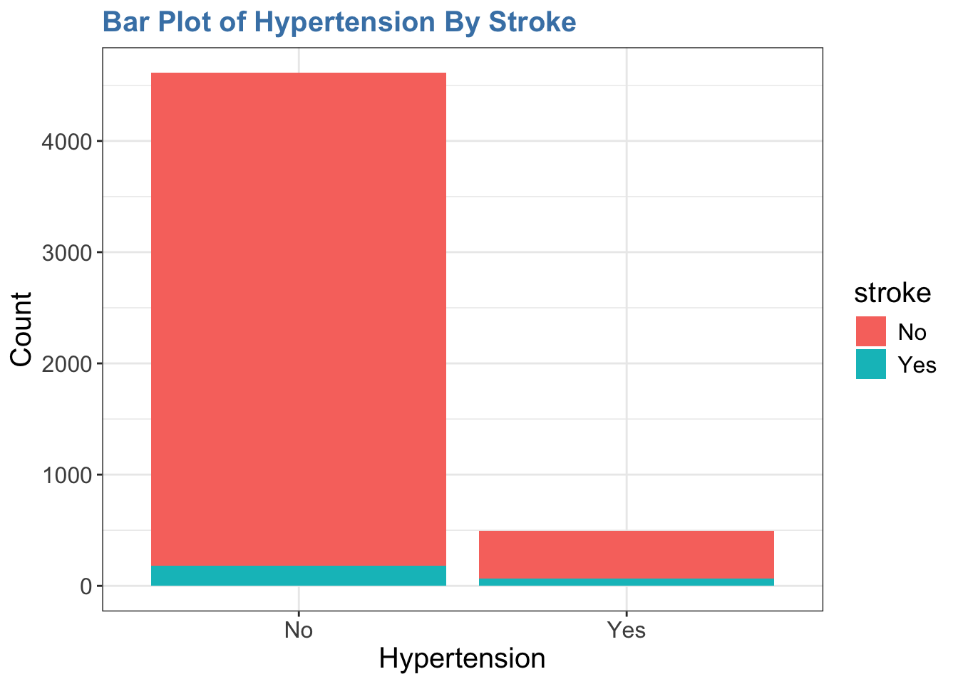
geom_bar() 함수는 stat = "count" 인자를 디폴트로 사용한다. fill aesthestic은 뇌졸중의 유무에 따라서 해당 부분의 막대의 색을 다르게 표현한다.
어떤 경우는 카운트나 비율(proportion)이 미리 계산된 데이터를 가지고 그래프 작업을 시작하는 경우도 있을 것이다.
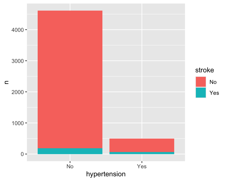
hypertension stroke n
1 No No 4429
2 No Yes 183
3 Yes No 432
4 Yes Yes 66(통계적 변환(statistical transformation) 개념을 소개하려 한다)
이 경우에는 2가지 방법을 사용하여 그래프를 만들 수 있다.
- 이미 카운트가 되어 있기 때문에
stat = "count"인자를 사용하지 않고,geom_bar()함수에stat = "identity"인자를 사용한다. 그러면 항등함수(값을 받아서 그대로 그 값을 출력하는 함수)가 사용된다.

- 두 번째
geom_col()함수를 사용하는 것이다. 이 함수는 데이터를 카운트하는 것이 아니라, 데이터를 그대로 표시한다. 이 함수의stat인자는 디폴트로stat = "identity"이다.
이제 여기에 레이블(labels)을 추가해 보자. 레이블 추가하는 labs() 함수를 주로 사용한다. 이것 역시도 하나의 레이어를 만든다. 이 함수 안에서 title, x, y 인자를 사용하여 레이블을 지정한다.
ggplot(stroke_df) +
geom_bar(aes(x = hypertension, fill = stroke)) +
labs(
title = "Bar Plot of Hypertension By Stroke",
x = "Hypertension",
y = "Count"
)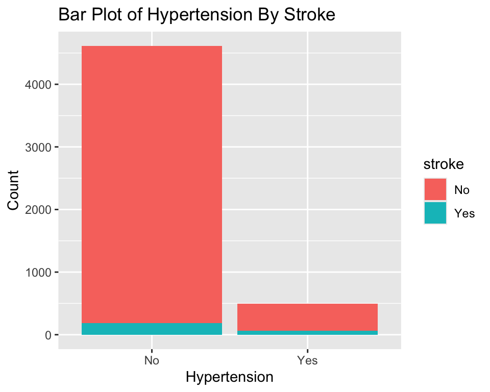
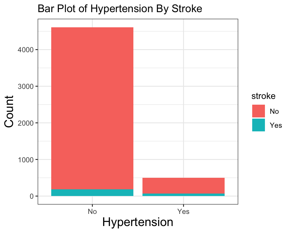
다음은 테마(theme)을 적용해 보자. 이것 역시도 하나의 레이러이다. theme_bw()과 같은 함수는 이미 정해진 테마를 지정할 때 사용한다.
ggplot(stroke_df) +
    geom_bar(aes(x = hypertension, fill = stroke)) +
    labs(
        title = "Bar Plot of Hypertension By Stroke",
        x = "Hypertension",
        y = "Count"
) +
theme_bw()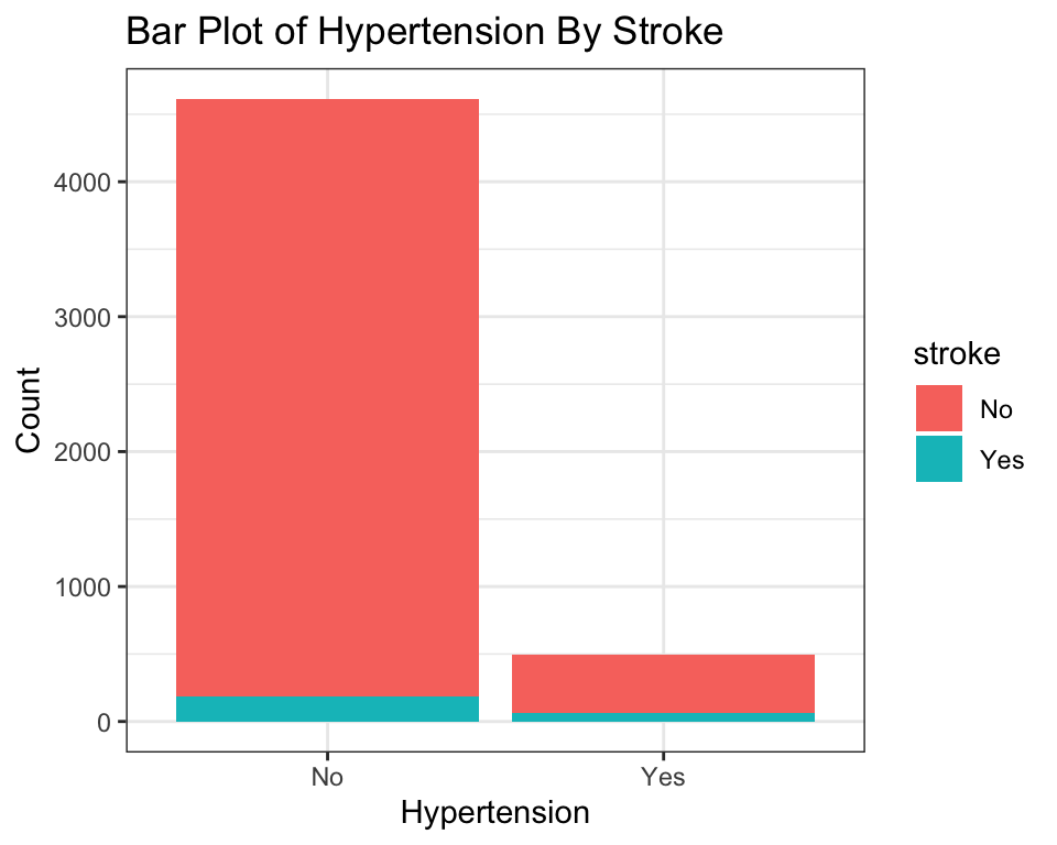
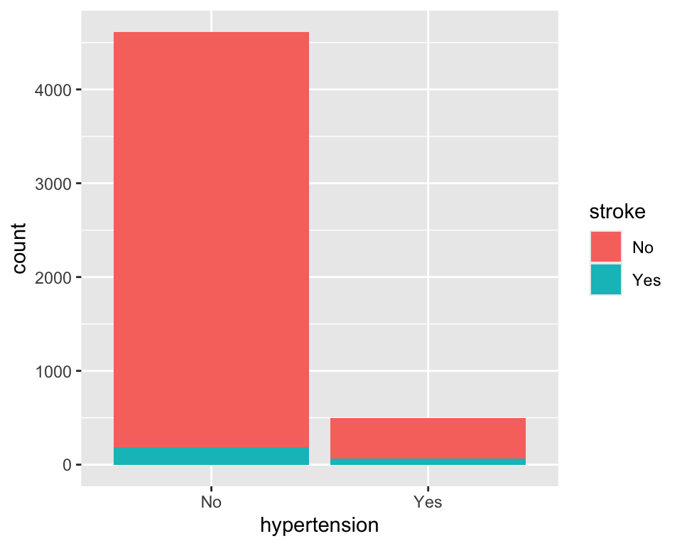
이렇게 생성된 그래프에서 theme() 함수를 사용하여 개별 요소들을 하나씩 자신의 취향에 맞게 조정할 수 있다.
ggplot(stroke_df) +
    geom_bar(aes(hypertension, fill = stroke)) +
    labs(
        title = "Bar Plot of Hypertension By Stroke",
        x = "Hypertension",
        y = "Count"
    ) +
    theme_bw() +
    theme(
        axis.title = element_text(size = 15)
    )
여기까지 진행하여 어느 정도 원하는 그래프를 얻었다. 이 과정에서 우리는 데이터를 매핑하고, 지옴을 추가하고, 레이블을 추가하고, 테마를 적용하는 등의 작업을 하였다. 이 과정에서 우리는 데이터와 그래프의 개별 요소들을 하나씩 조정하여 원하는 그래프를 만들었다.
지금까지 우리는 스케일(scales)을 명시적으로 다루지는 않았다. 그렇지만 하나의 매핑에 대응하는 디폴트 스케일들이 사용되고 있다. 예를 들어 x = hypertension에 대응하는 스케일은 범주형 변수이므로 범주형 스케일이 사용되고 있는데, scale_x_discrete() 함수를 사용하여 스케일을 직접 조정해 볼 수 있다. 그러나 이 부분은 뒤에서 더 자세하게 설명하고자 한다.
이제 패시팅(faceting)만 추가로 적용해 보자. 이것은 데이터를 작은 데이터셋으로 나누어 각각의 데이터셋에 대해 그래프를 만들고, 이것들을 모아서 배치하는 것을 말한다. 그룹별 차이 등을 확인하는 데 유용하다.
ggplot(stroke_df) +
    geom_bar(aes(hypertension, fill = stroke)) +
    labs(
        title = "Bar Plot of Hypertension By Stroke",
        x = "Hypertension",
        y = "Count"
    ) +
    theme_bw() +
    theme(
        axis.title = element_text(size = 15)
    ) +
    facet_wrap(~stroke)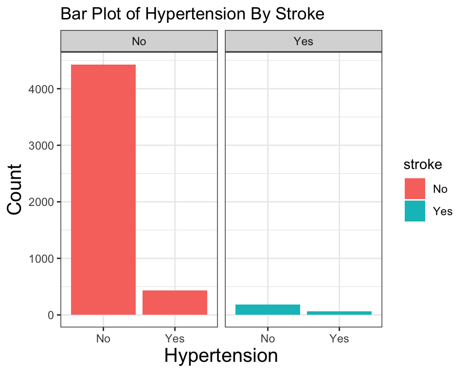
20.3 ggplot2 패키지를 사용할 때 꼭 기억하고 있어야 하는 것들
ggplot2는 레이어를+연산자를 사용하여 추가하고,+연산자로 추가된 레이어는 일반적인 R 데이터와 같이 변수에 할당할 수 있다. 이렇게 할당된 변수는 일반적인 R 객체처럼 그 이름으로 출력할 수 있다.ggplot2로 코딩할 때는 변수의 이름에 따옴표를 붙이지 않고, 그 이름 그대로 사용한다(비표준 평가).
# 변수를 업데이트
p <- p +
    labs(
        title = "Bar Plot of Hypertension By Stroke",
        x = "Hypertension",
        y = "Count"
    )
# 마지막 변수를 출력
p
-
ggplot2의 레이어는 독립적으로(independently) 존재하여, 자체의 데이터, 매핑, 지옴, 통계 변환을 가질 수 있다. 따라서 다른 데이터를 종합하여 하나의 그래프를 만들 수 있다.
library(stringr)

ggplot(mtcars, aes(x = wt, y = mpg)) +
    geom_point(
        data = mtcars[str_detect(rownames(mtcars), "Merc"), ],
        aes(x = wt, y = mpg),
        color = "red"
    ) +
    geom_point(
        data = mtcars[!str_detect(rownames(mtcars), "Merc"), ],
        aes(x = wt, y = mpg),
        color = "blue"
    )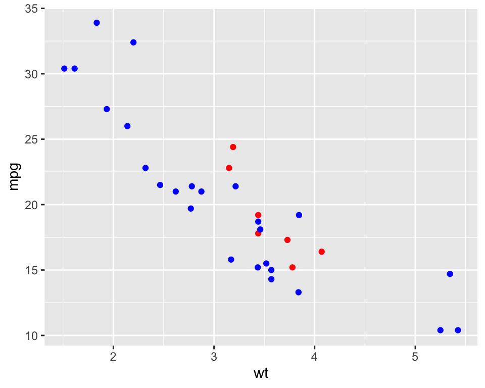
- 하지만 위와 같이 사용하는 경우는 흔하지 않다. 더 흔한 패턴은
ggplot()함수에 데이터를 전달하여, 그 이하에 뒤따르는 모든 레이어가 자체의 데이터셋을 지정하지 않는 경우에는ggplot()함수가 전달된 데이터셋을 사용한다. 데이터 뿐만 아니라 매핑도 마찬가지이다. 그런데 어느 함수에 어떻게 지정하는지에 따라서 결과가 달라질 수 있다. 조금 시행착오를 하고 나면 분명히 이해가 될 것이다.
다음 경우는 데이터와 매핑이 ggplot() 함수에 사용되었고, 뒤따르는 geom_point() 함수와 geom_smooth() 함수는 자체의 데이터셋과 매핑을 지정하지 않았다. 따라서 ggplot() 함수에 전달된 데이터셋과 매핑을 사용하여 그래프를 만든다.
ggplot(stroke_df, aes(x = bmi, y = avg_glucose_level)) +
    geom_point(alpha = 0.1) +
    geom_smooth(method = "lm")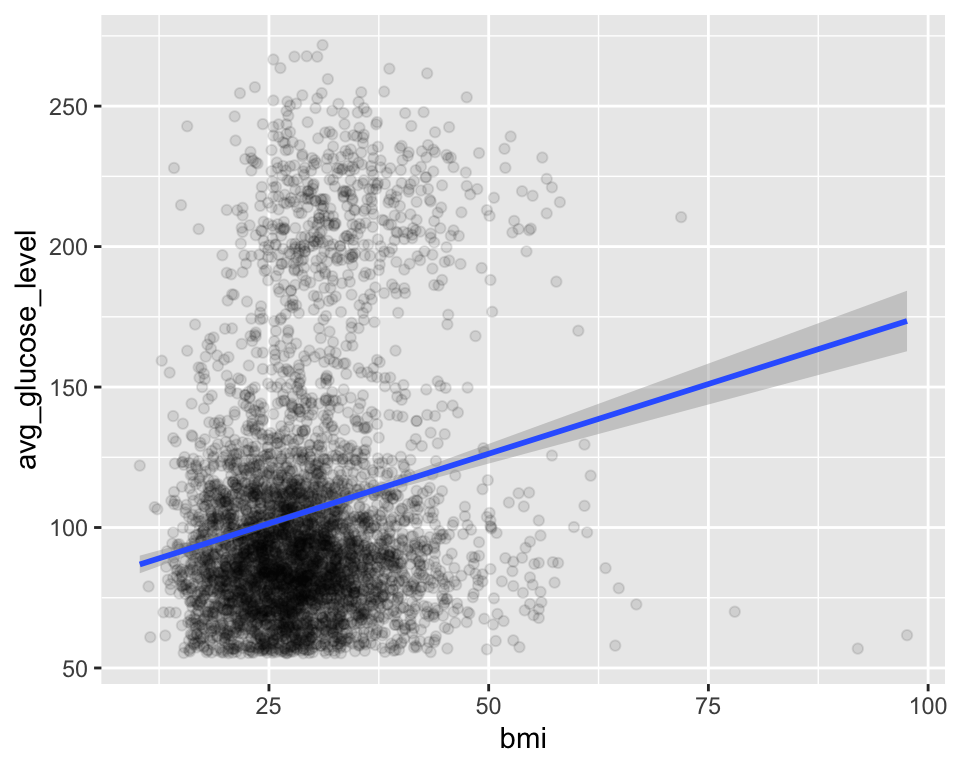
다음 경우는 geom_point() 함수는 데이터셋과 매핑을 지정하지 않아서 ggplot() 함수에 전달된 데이터셋과 매핑을 사용하여 그래프를 만든다. 반면, geom_smooth() 함수는 자체의 매핑을 사용하여 그래프를 만든다.
ggplot(stroke_df, aes(x = bmi, y = avg_glucose_level)) +
    geom_point(alpha = 0.1) +
    geom_smooth(aes(color = stroke), method = "lm")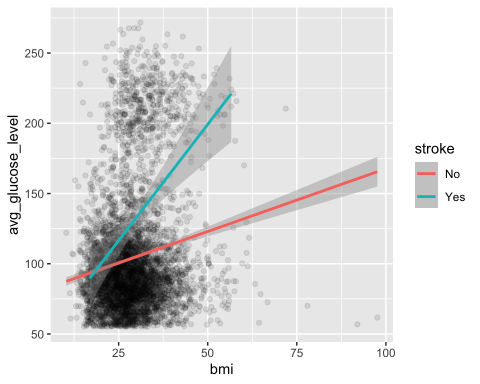
- 그룹핑이나 패시팅은 모두 데이터를 분리하여 그래프를 만든다는 점에서는 유사한데, 경우에 따라 어떤 것이 더 효율적일 수 있다.
다음은 색에 의한 그룹핑을 사용한 경우이다. 이 경우에는 오버플롯팅으로 눈에 잘 들어오지 않는다.
ggplot(stroke_df, aes(x = bmi, y = avg_glucose_level, color = stroke)) +
    geom_point(alpha = 0.3) +
    geom_smooth(method = "lm")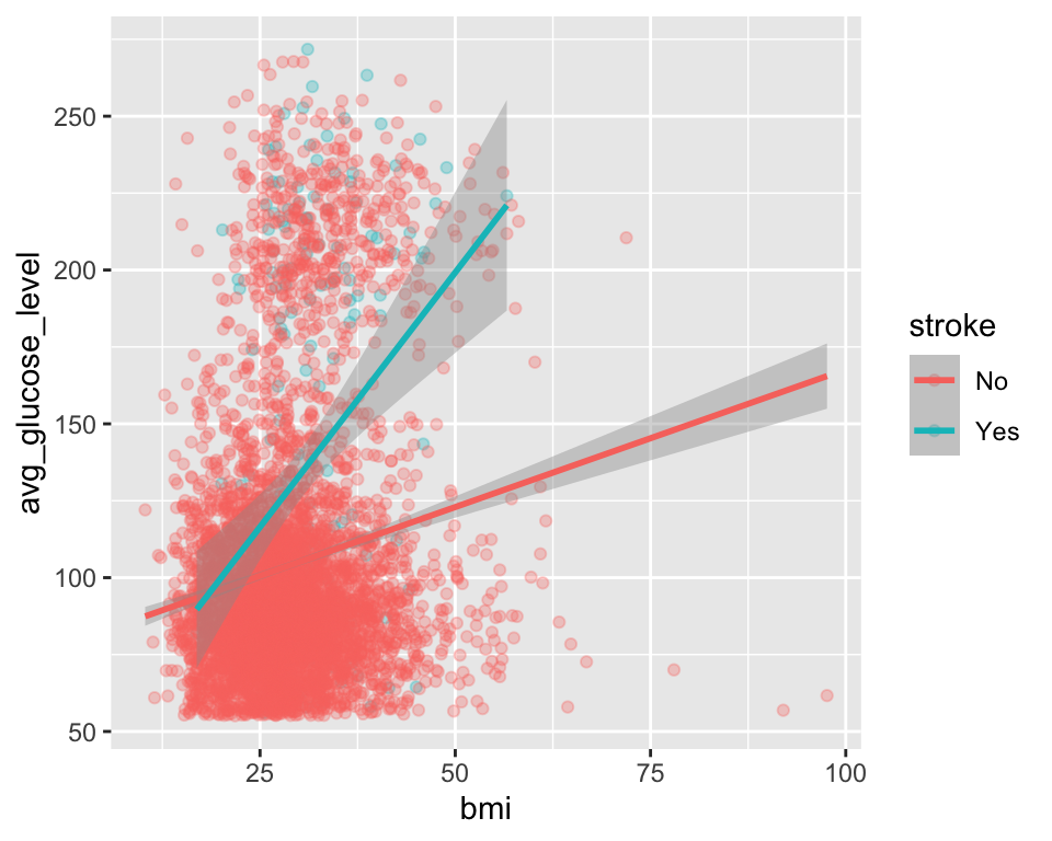
다음은 패시팅을 적용하여 분리한 것이다. 이 그래프를 보면 뇌졸중이 있는 그룹에서 bmi 대 avg_glucose_level 사이의 상관관계가 더 크다는 것을 보여준다.
ggplot(stroke_df, aes(x = bmi, y = avg_glucose_level, color = stroke)) +
    geom_point(alpha = 0.1) +
    geom_smooth(method = "lm") +
    facet_wrap(~stroke)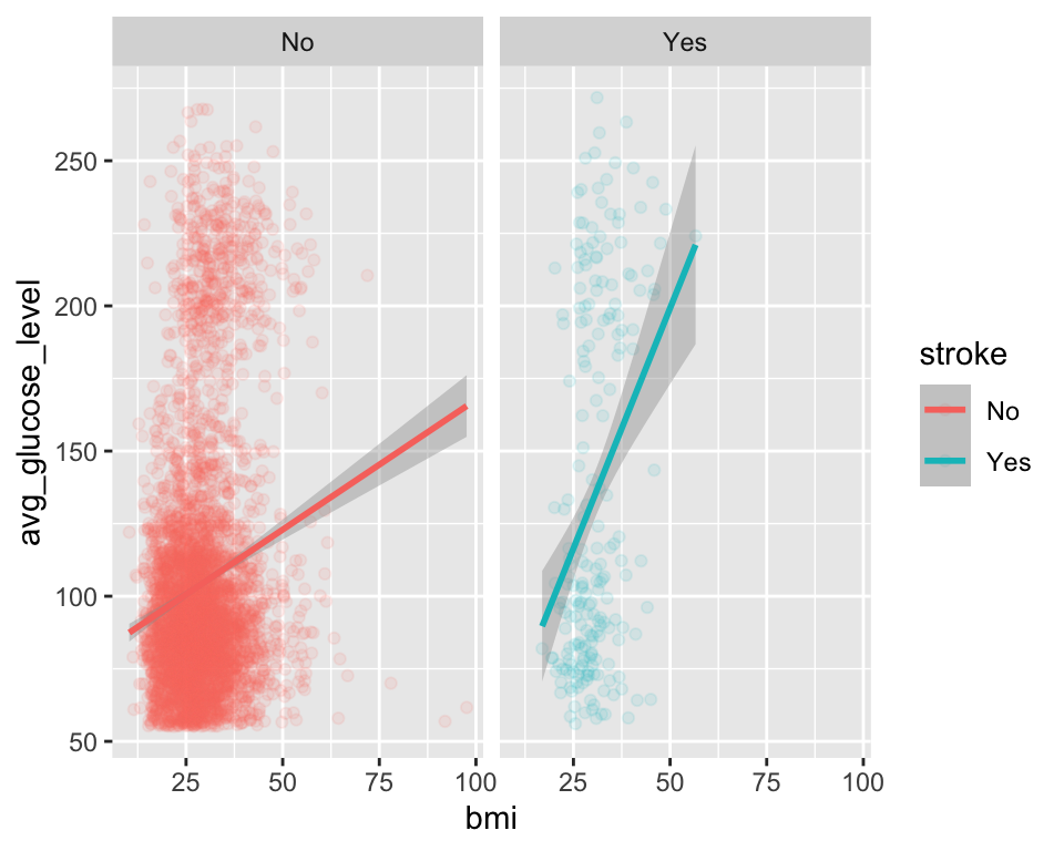
-
ggplot2패키지의 함수 안에서 일반 수학 연산이 모두 가능하다.
ggplot(stroke_df, aes(x = log10(bmi), y = avg_glucose_level, color = stroke)) +
    geom_point(alpha = 0.5) +
    geom_smooth(method = "lm")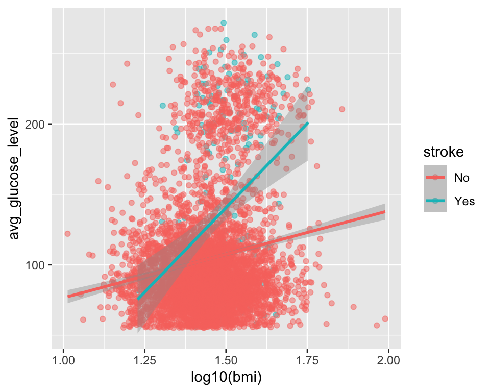
ggplot2패키지는 tidy 데이터프레임을 사용한다. 따라서dplyr,tidyr패키지 등을 사용한 데이터 전처리가 필요한 경우들이 있다.-
데이터 프로세스와 테마 프로세스의 분리:
ggplot2패키지는 데이터 관련된 프로세스와 제목/레이블/테마 등 주변 시각적 요소와 관련된 프로세스를 분리하여 생각하는 것이 중요하다.- 보통 데이터 관련된 프로세스를 먼저 진행하고, 그 다음 제목/레이블/테마 등을 진행하는 과정을 밟는다.
RStudio 그래프 뷰어는 한글을 지원하지 않는다. 이런 경우에는
showtext패키지를 사용하여 한글을 사용할 수 있다.완성된 그래픽 객체는
ggsave()함수를 사용하여 다양한 크기, 포맷, 해상도 등으로 저장할 수 있다.